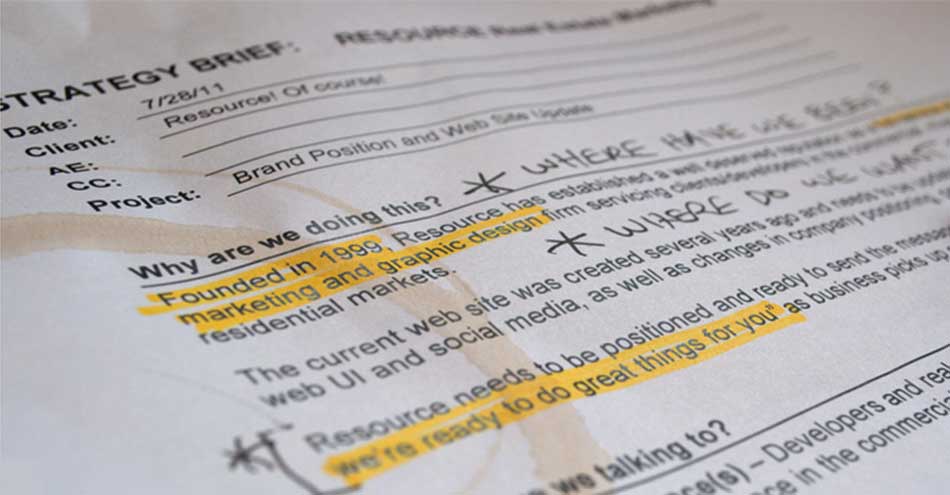
Embarking on a brand refresh for a company is never an easy exercise, especially if that company happens to be your own. After 12 successful years in business, Resource needed a brand refresh that reflected our growth and evolution as a company. But that need also generated some important questions. Did we want a revolutionary or evolutionary change in our identity? How should we differentiate ourselves from our competition and create messaging that would resonate with our current and future clients? And most importantly, what would we communicate as the essence of what we believe and practice on a daily basis as a company? Fortunately, we had a well-defined and objective process in our back pocket to assist in finding those answers.
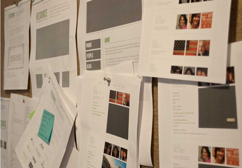
Our journey began with kitchen coffee talks, group lunches and snack-fueled discussions at the big board. Over time our process led us step-by-step through analysis, definition, and the development of our evolved positioning, the benchmark from which we would develop all facets of our new brand.
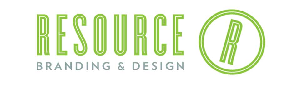
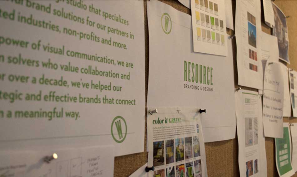
Simplify. Say directly who and what you are. We were formerly known as Resource Real Estate Marketing. But our brand process indicated that the name no longer expressed the essence of what we really provide for clients. So we retained the aspects of our brand with the most equity: the Resource name along with the signature brand green – then added “Branding & Design” to properly position the company. Fonts were explored and customized, while our new positioning was integrated into the design of the mark. In addition, we created the Resource Circle R as a complementary branding device that can be used in a variety of interesting ways.
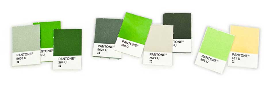
A new, extended color palette was created, giving us broader options to work with as we made color choices for identity components as well as our new space. New space? Because we love a good challenge we decided to add a move to new office space into the rebranding process!
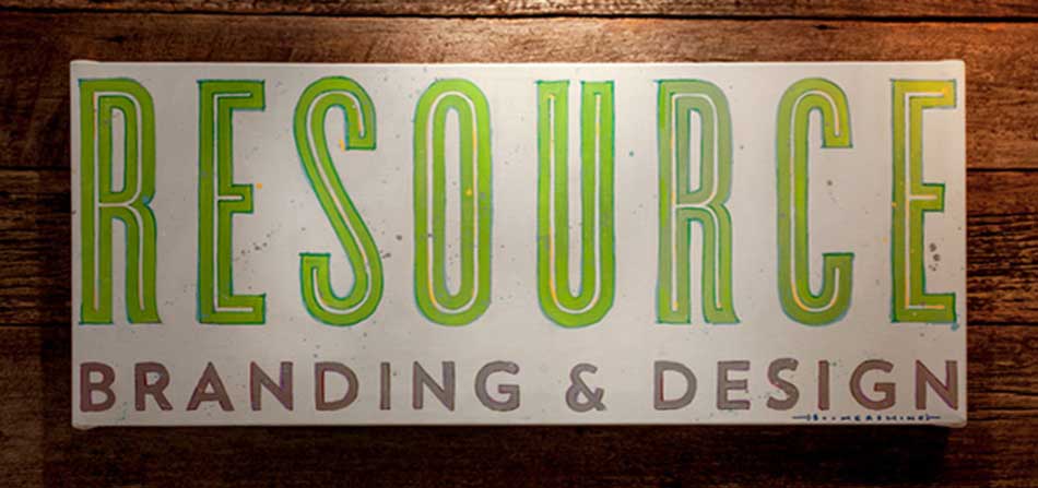
With our logomark and color palette in place, we commissioned Atlanta artist and good friend, Mark Boomershine, to paint our new logo on canvas – as a work of art that welcomes visitors and sets the tone for our comfortable and collaborative new space.
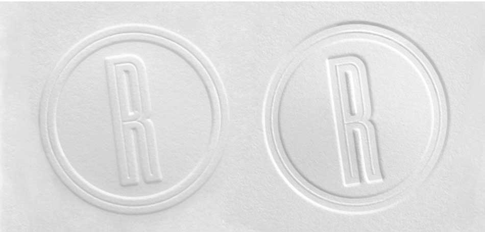
We believe in using the many mediums available to express brand. So much of what we create now exists only in the digital realm, but when appropriate we still love the tactile impression of elegant papers and quality processes. Beautiful embossing and debossing of our Circle R gave us tasteful options to choose from.
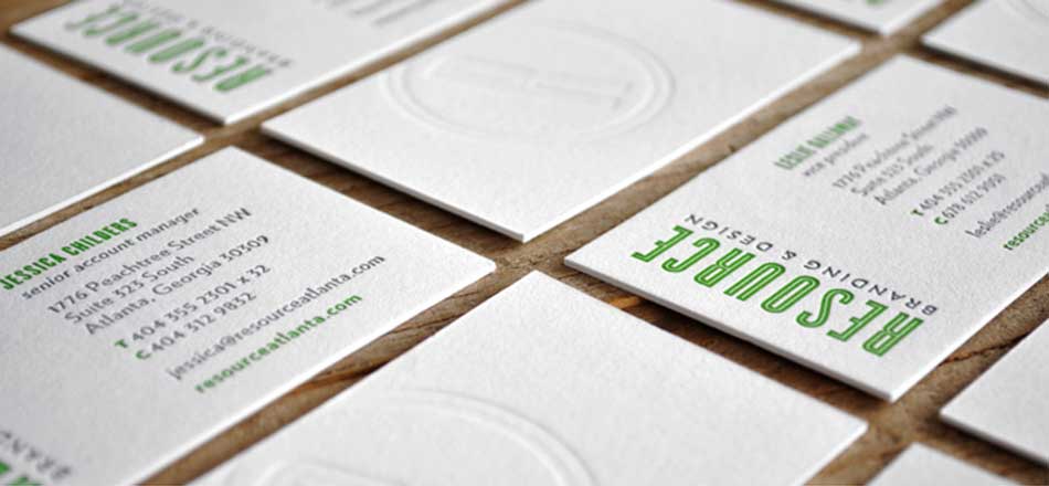
We know and live by the power of first impressions. Thick, letterpressed cards with our debossed R on the back make a favorable impression and set a tone that notes our attention to details and craftsmanship.
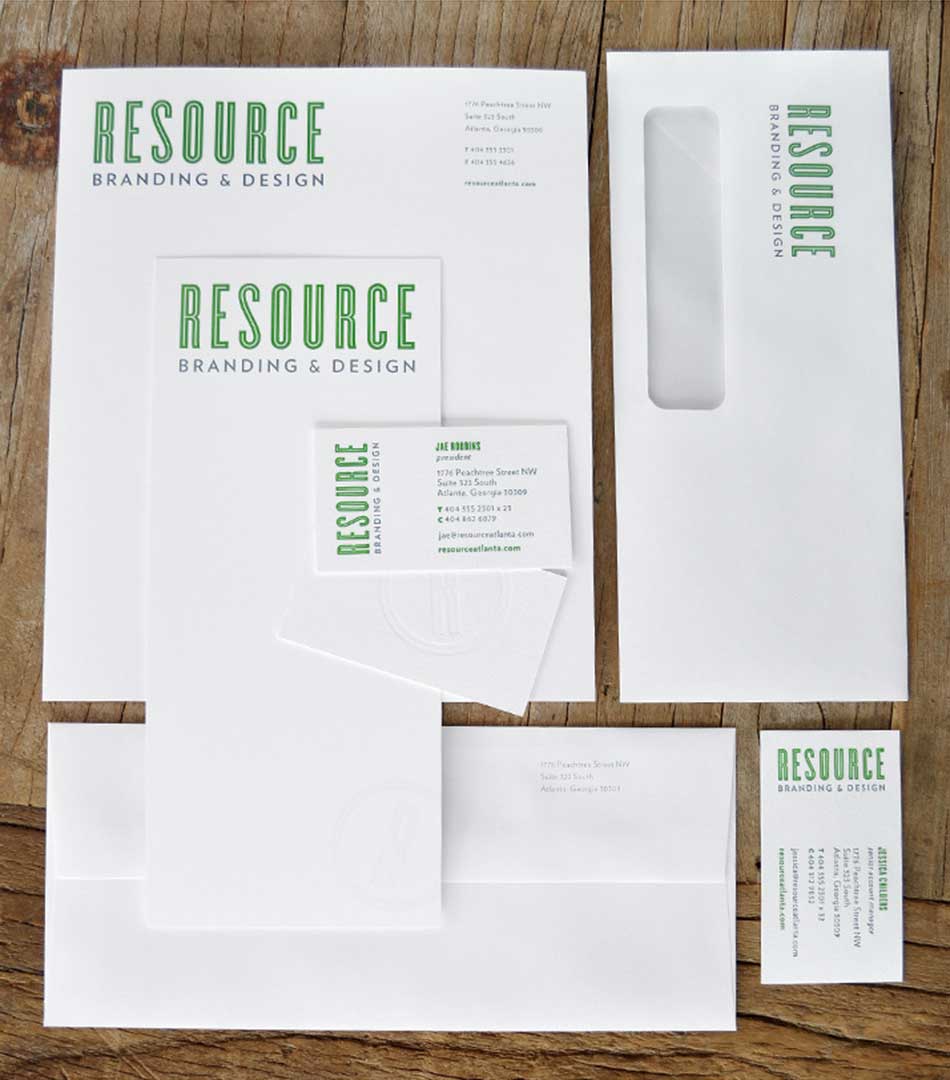
With the brand foundation in place, the print identity was extended to all components. In addition, we created brand templates for presentation materials and RFPs.
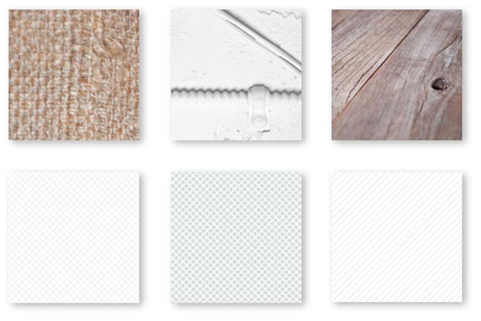
As part of our brand extension, we also created a texture palette. These patterns and textures would play a role in the look and feel of web site and the buildout of our new space. We’re slightly obsessed with burlap.

A custom brand icon set was designed for use in our proposals and presentations. Curious about their meaning? Contact us for an RFP and all icon secrets will be revealed.
The Resource site was designed to serve as our primary brand touchpoint, and gives viewers insight into how we work and think. The tone of the site is friendly, the look is open and clean, and it provides an excellent platform for displaying our personality as well as capabilities.

The new space was designed to be bright, open and collaborative. Brand touches are spread throughout the office with the use of color, textures and finishes. We love to have visitors at our new space so please stop by and see us!
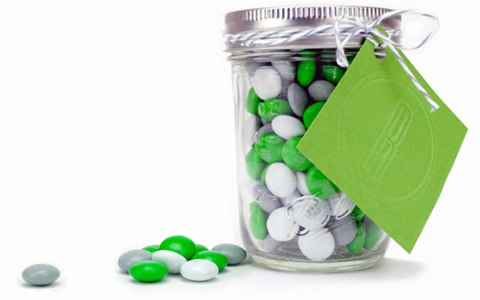
Our constant desire for chocolate led us to create the Resource brand M&M’s gift jar. And if you’re here on a very special day, one of Woody’s world famous Resource green margaritas could magically appear in the kitchen.