At the beginning of each year, we get together as a team to discuss goals and analyze trends that are impacting our industry. It’s always a lively and inspiring conversation about aesthetic styles and design treatments and how we apply them to our work in branding for people and places. This year, there was clear consensus on our favorite design trends:
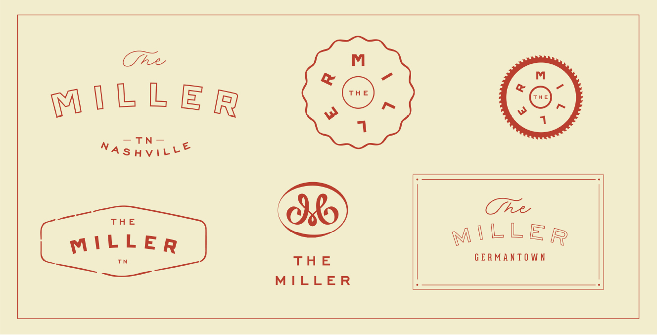
No. 1 – Flexible Logo Design
The static logo has proven to be insufficient in modern visual communication. Flexible logos demonstrate new systems that evolve with work. These visuals have the ability to formulate different messages, adapt to different situations and resonate with different individuals.
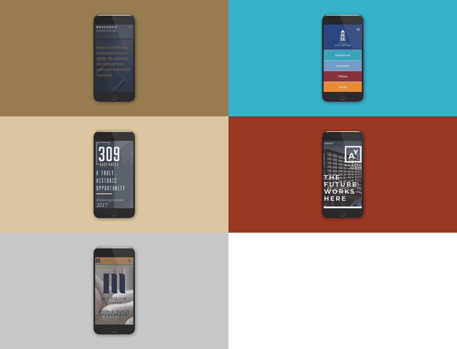
No. 2 – Mobile Focused Design
With the constant development of technology, responsive website designs have seen massive shifts in the way users receive and digest information. In a fast-paced society, mobile designs are becoming more succinct and simple. Bold typography, minimal content, and interesting use of color are becoming the new norm.
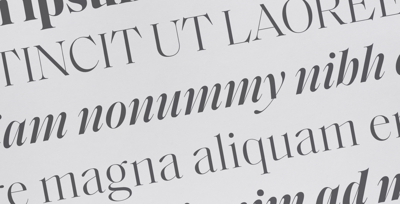
No. 3 – Dramatic Typography
As type design continues to evolve, more and more type foundries are embracing the eccentricities and quirks that letterforms can make. This seems to be resulting in more dramatic and distinctive type families—and we’re okay with that. Because while there’s a time and place for those tried and true font favorites, we’re seeing that there’s also space for the lesser-known typefaces with a little more flair.
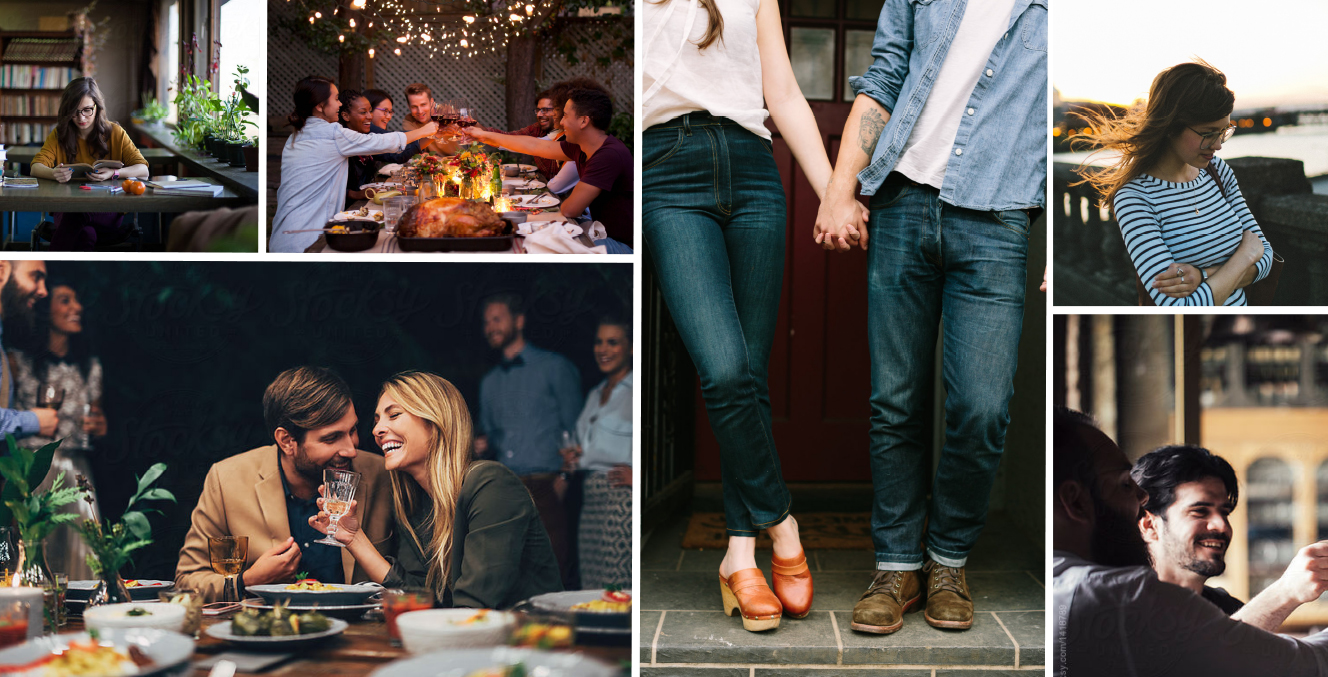
No. 4 – Moody Photography
One of the biggest trends in lifestyle photography is a shift towards imagery that is less posed and processed and more diverse and down-to-earth. As individuals continue to aspire to sincerity and a sense of authenticity, lifestyle photography is following suit. Models are out and real people are in!
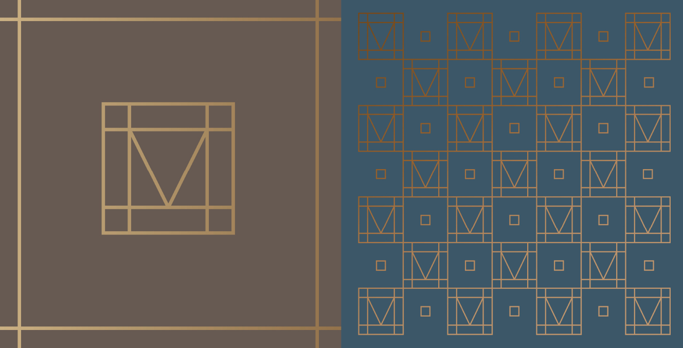
No. 5 – Branded Patterns
Whether subtle or bold, brand patterns add a unique dimension that can help a brand identity stand out from the competition. Patterns can also unify brand across various mediums such as website, collateral, packaging or signage and engage audiences while enlivening the brand look and feel.
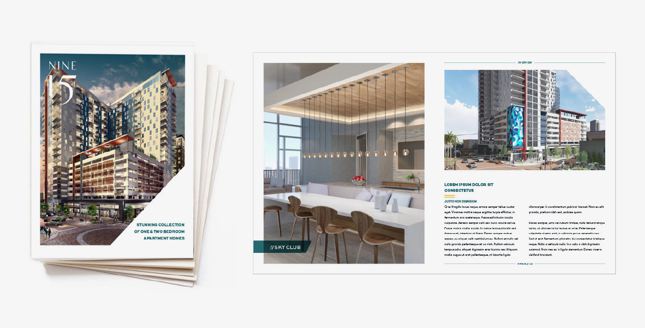
No. 6 – Editorial Sensibility
They say there’s beauty in restraint and as designers, we are always pushing for more white space. Whether it’s a in a brochure or on a website, we have found that limiting our color palettes and letting the imagery and typography shine allows the viewer to truly focus on what’s most important.
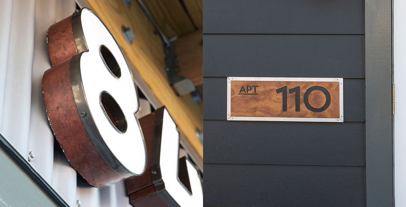
No. 7 – Material Environment
Environmental graphic design—even with the continued influx of digital elements—is increasingly demanding the use of rich and textured materials. Striking a nice balance between material and digital will be the defining aspect of environments today and in the future.
No. 8 – Hyper Duotones
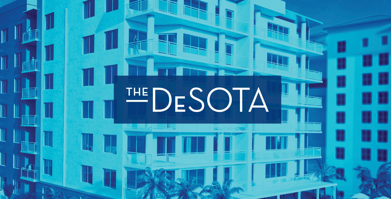
As photography continues to be a vital part of branding, image effects are becoming an increasingly popular way to customize imagery to your brand. The “Duotone” effect in particular has become a favorite way to turn regular images into graphic two-color works of art. Not only does this allow for imagery to reflect the brand palette but it also ads a fresh, vibrant energy to the brand experience.
No. 9 – Custom Illustration
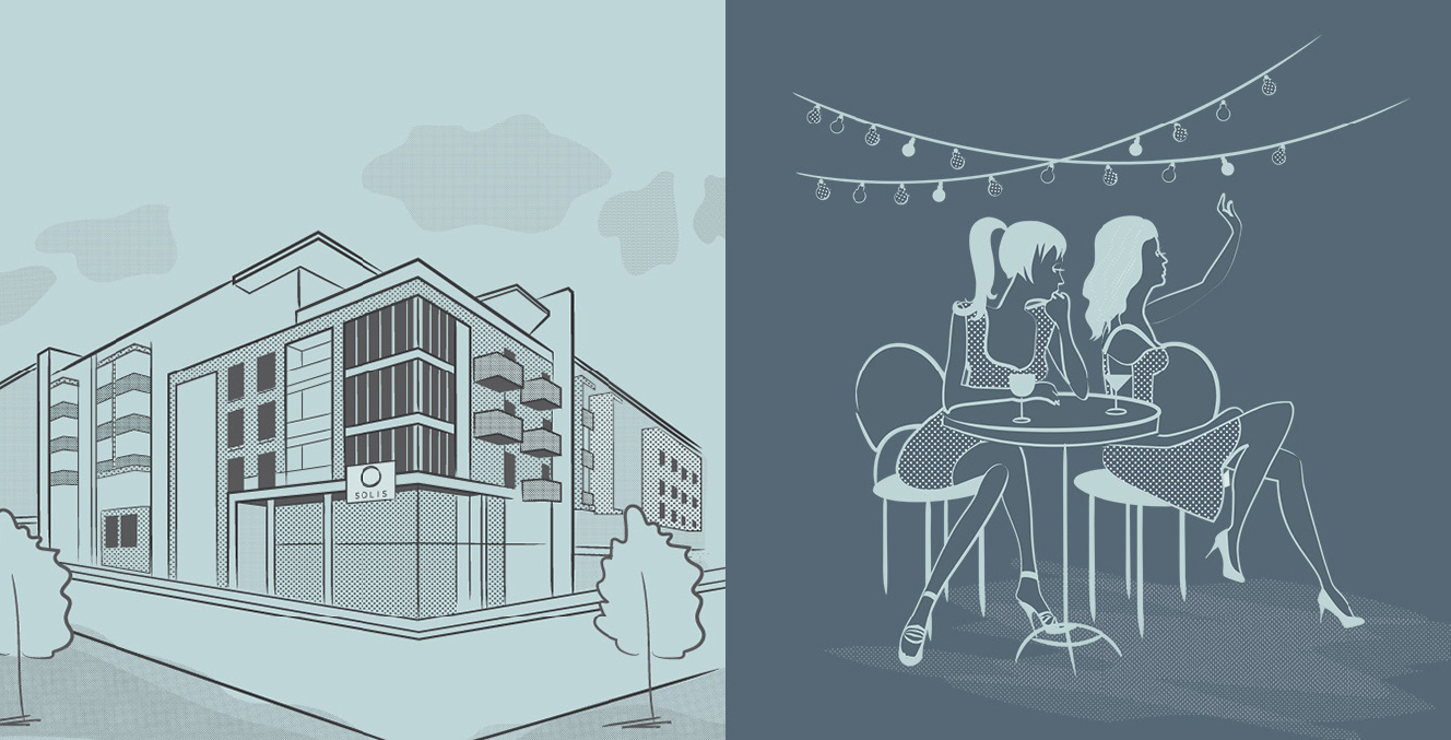
Similar to the shift towards more authentic photography, illustration has started to evolve from clean and graphic icon designs to a more organic, imperfect illustration style. With a sense of craft and personality that is so key to the brand experience, we will continue to see illustrations used not only in addition to but also in place of imagery within the brand itself.
No. 10 – Web Microinteractions
Microinteractions are those little delightful moments that users experience as they navigate websites on all types of devices. Web design will continue to demand their use and really successful sites will take advantage of the influence they can have on design and informational importance. Microinteractions may be small, but they sure are mighty.
