Main Content Container Maximum Width
Unlike printed pages, web pages need to fit their information in a myriad of media sizes, from small phone displays (around 320px wide at the smallest) up to large desktop displays (2048px and beyond!). Since elements on the web page scale in two directions, horizontal & vertical (X and Y), it usually makes sense to set an upper limit to the maximum size of the design by creating a container with a maximum width – the ‘maximum content area width’.
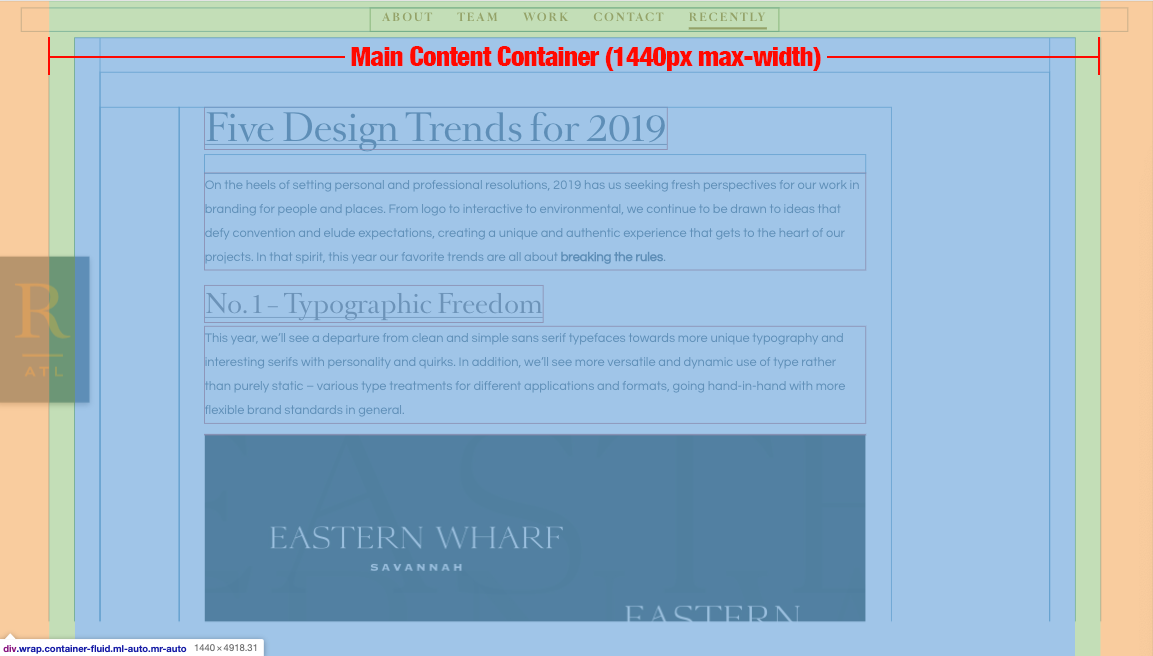
Below is a screen shot of web page displayed on a ‘typical’ mid-resolution display set at 1600px x 900px. Remember that typically the width of the browser window is not as wide as the display; most users do not browse with the window set at 100% of the display, especially on higher-resolution (wider) displays. Additionally, the various scrollbars, menu bars, widgets, etc. of the browser will further reduce the browser width and height by a little. For these examples, consider the browser window size equal to the display size.
Below is a screen shot of the same web page on a display that is 1920px wide by 1080px tall. Again, for illustrative purposes the display width / height is considered the same as the browser window width / height:
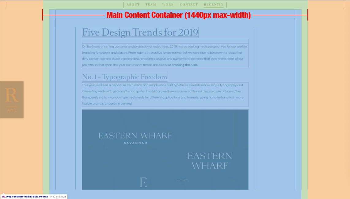
The main content container constrains the width of the content to 1440px wide, even though the browser window is 1920px. In this example, the main content container is centered on the page, but it can just as easily be justified to the left or right of the browser window. Notice also that the ‘R’ navigation element is positioned outside the main content container and will always stay on the absolute left of the browser window.
The final example shows a fairly extreme display dimension of 2048px x 1152px. In this example, the main content container has no maximum width applied to it and therefore all the content is able to scale up in both the vertical and horizontal dimensions.
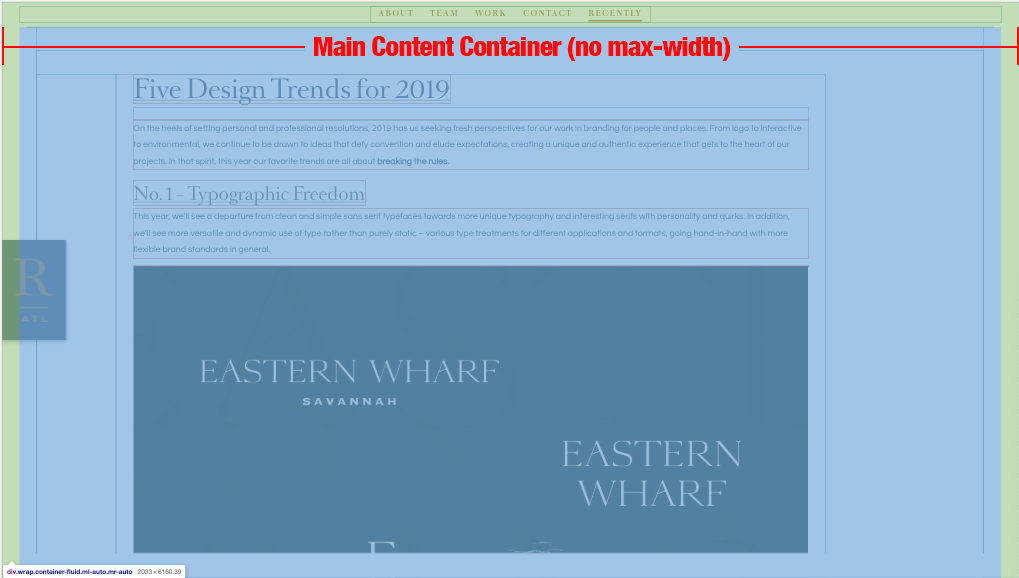
There are some problems with this approach. Lines of text get too long to comfortably read. Images start to get too large and will inevitably scale up beyond their fixed resolution and start to ‘look soft’. Generally, it is not a good user experience.
When designing sites, it is a good idea to take into account what the maximum width of the main content should be. A good rule of thumb may be somewhere around the 1400 – 1440px range, but ultimately it will come down to the design and how it works within the browser. There may be cases where elements of the design should position themselves the left or right edges of the browser. There also may be cases where it makes sense for some elements to always fit the width of the browser, while other elements are contained within a container with a maximum width. Take all of this into consideration.