Visualizing The Difference Between .container & .container-fluid
The Twitter Bootstrap framework comes with two different content container classes for containing your content – .container and .container-fluid. The difference may seem subtle at first, but it is important to understand. Usually there is one container on the body content that ‘contains’ all of the content. The header and footer content may or may not need a container, depending on how that content is intended to flow with the rest of the page.
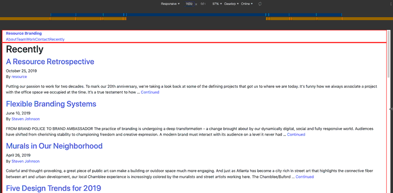
THE CONTAINER CLASS
The default layout uses the .container class. This class has a set max-width pixel value applied to it, dependent upon where the width of the browser window falls among the media query breakpoints. The default max-widths are as so:
- XS breakpoint: browser width 320px up to 575px = The container’s max-width is 100%
- SM breakpoint: browser width 576px to 767px = The container’s max-width is 540px
- MD breakpoint: browser width 768px to 991px = The container’s max-width is 720px
- LG breakpoint: browser width 992px to 1199px = The container’s max-width is 960px
- XL breakpoint: browser width 1200px and up = The container’s max-width is 1140px
This may be difficult to visualize, so an animation is added below. In the animation, the container is highlighted with a red border. The browser window starts at 1600px wide. You can already see that the container is limiting the width of the content it contains, because its max-width is 1140px.

As the browser window is narrowed, the container’s max-width changes and you will see abrupt ‘jumps’.
Referring back to the list of breakpoints:
- at 991px wide (the high dimension of the MD breakpoint), the container changes to 960px wide.
- at 767px wide (the high dimension of the SM breakpoint), the container changes to 720px wide.
- at 575px wide (the high dimension of the XS breakpoint), the container changes to 100% wide, filling the width from there down to 320px wide
THE CONTAINER-FLUID CLASS
For comparison, here is the same page with container-fluid applied to the content:
In this example, container-fluid always has a max-width of 100%. So the content will always stretch to fill the width of the browser window.
Using the container class instead of container-fluid will result in a design at certain browser widths (specifically the high dimension of the breakpoints) with large areas of white space on both sides. If it is important that the content stretch the full width of the browser window at all widths, then use the container-fluid class. On the other hand, sometimes it is desirable to use container in order to minimize the points at which the design ‘reflows’ due to the browser width.
It may make sense to use a mixture of container and container-fluid in the markup, depending on the design.
THE WRAPPING ELEMENT
Most of the time, it’s a good idea to surround all the main content in a final wrapping element that constrains everything to a max-width, no matter the width of the browser. So for example, the wrapping element would be a single max-width of 1440px only. This is much like the standard container’s maximum max-width of 1140px. That way, the main content doesn’t spread out so far that you have long single lines of text that are difficult to read.
This will also be dependent upon the design, and it may make sense to constrain some content while letting other content fill the width of the browser window. Just remember that content like images resize in two dimensions and they will also eventually ‘break up’ when the browser width is greater than the pixel dimension of the image.